
About The Christian Alphabet
The Christian Alphabet is an illustrated picture book designed by myself to take children across the entire alphabet through a biblical lens. Whether for use in the home, school, or church, this book serves as an incredible tool to inspire and teach children about their faith. Each letter’s illustration seamlessly integrates the shape of that letter into its design allowing for children to have fun searching for, and recognizing, the letter. Biblical references are tied into each composition, allowing for children, and adults, to engage in a discussion about the deeper meanings throughout the book.
This book originally started out as just a single letter illustration as a project that was assigned during one of my college courses, however, soon after I decided to make a complete series of the alphabet for my senior thesis and exhibition. My goal was to create a complete series that:
- Illustrates the alphabet through a biblical lens
- Teaches the values and beliefs of Christian faith
- Includes illustrations that would be biblically accurate and span across former and modern times
- Uses words/topics/ideas that would be unique or not commonly referenced
- Avoids using characters from the Bible, with the exception of Jesus, to allow for more words/topics/ideas to be used
- Creates conversations between children and their parents discussing the words/topics/ideas
- Seamlessly integrates each letter’s shape into the design
- Consistently uses the same graphic style and standards with each illustration
This became quite the challenge in trying to figure out a complete set of words that felt appropriate for children and followed the guidelines I set above. Once I felt I had compiled enough words for a majority of the letters (with a lot of help!), I began moving into illustrating them. The next challenge became how to illustrate them in ways that would not only integrate the shapes of the letter seamlessly, but also visually rest in the same location centered on the page as the other letters making them easier to identify. Not to mention, doing all of this using the objects pertaining to the word/topic chosen: for example, the shape of the letter “A” being made within the ark or the letter “B” in the shape of a Bible. As you can imagine when it came to letters such as “D”, “Q”, “W”, or “X” this became quite frustrating! When I first expressed my idea for this series with friends and family, many didn’t believe it would be possible, but wished me luck anyways! Yet, with the help of my parents, friends, teachers, and others I was able to complete the series!
However, none of this would have been possible without God and His inspiration! There were many, many, moments during the process of creating this series that I didn’t feel I could finish it. Over the course of the 7 months, 300+ hours creating/designing, and countless other hours researching, there’s nothing I did more than pray for this series. I prayed for inspiration, guidance, wisdom, understanding, interpretation, and solutions to the problems I faced while making everything. Many nights I found myself unable to sleep, troubled by my inability to move forward due to one hurdle or another. Yet, at the same time, there were nights where I would wake up unexpectedly like at 3am in the morning, and I could feel God’s presence guiding my mind to the solutions; in many cases leading me to sketch them out on scrap pieces of paper or post-it notes. In other cases, sources of inspiration or knowledge would come across my path whether scrolling on social media or just random occurrences. Yet, these occurrences weren’t so much random but rather perfectly timed. It seemed like with each letter I was working on God was providing the exact knowledge and wisdom I needed from various sources to use within my designs for them. He also used the places where I was during that time, like the absolute blessing it was to be studying at a Christian university where I had professors with insane amounts of knowledge of scripture, theology, philosophy and so much more to pull from, as well as meeting friends and colleagues who were of the same faith who helped me brainstorm ideas for these illustrations.
It wasn’t until the summer started where I felt called to pursue turning this series into a legitimate children’s book. I had no idea how to go about doing so, but I continued to pray about it and in the meantime work towards completing the series. A few months later, randomly scrolling on social media, an ad came across for a Christian publishing company looking to publish new authors; perfect timing. I kept the ad saved away and when I finished the illustrations in late October of 2023, I submitted my manuscript to the publisher and waited to hear back. Two weeks later the publisher approved my manuscript and set up a consultation for me to read the contract and sign on the dotted line, but I didn’t feel at peace about it. The very same day, a letter advertisement was sent to my house from another publisher, Christian Faith Publishing, saying they were also looking to publish new Christian authors. After a phone consultation, I submitted my manuscript the next day. Five days later I got the call that it was approved by Christian Faith Publishing and they sent me a contract that I had much more peace about (to celebrate I went out and bought Chick-fil-A and a new LEGO set!). It wasn’t until after I had signed the contract and submitted the finalized manuscript that through the advice of my father and the publisher, we all came to the agreement that the book would be further benefited by including, side-by-side with each corresponding illustration, the scriptures that I referenced in creating the illustration. It was after this point that the book came into full fruition and is what has now become The Christian Alphabet!
Included below are some of my original sketches for some of the illustrations and their final versions in comparison.
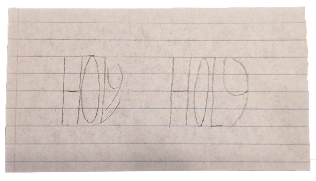
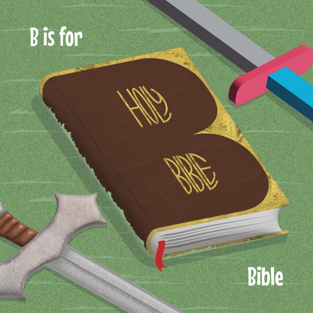
This sketch was my attempt at trying to figure out how to fit the word “HOLY” into the negative space formed within the letter “B”. As you can see the version on the left was used in the final illustration on the right.
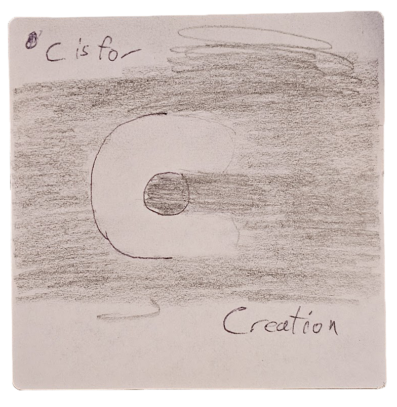
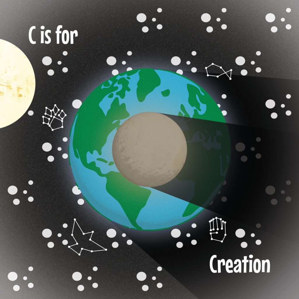
This sketch was one of the ones that I awoke late at night trying to figure out how to incorporate the shape of the letter “C” while representing creation. In this sketch the main focus was playing with the idea of shading and using contrast to create the shape of the letter “C” with juxtaposition of a dark small object casting a shadow in front of a larger and brighter one. In the final version this is seen as the moon in front of the Earth.
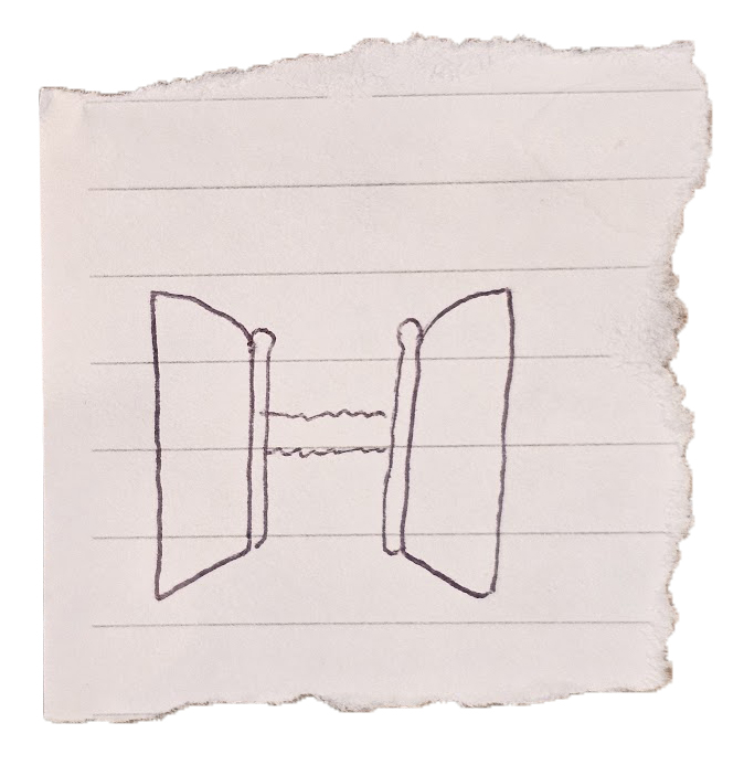
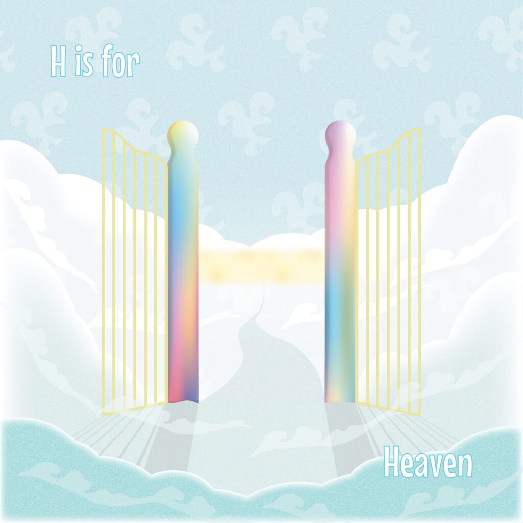
This small thumbnail sketch was visualizing my thoughts for the gates of Heaven to see if there was a way to create the shape of the letter “H”. As you can see this sketch served as the foundation for the final version.
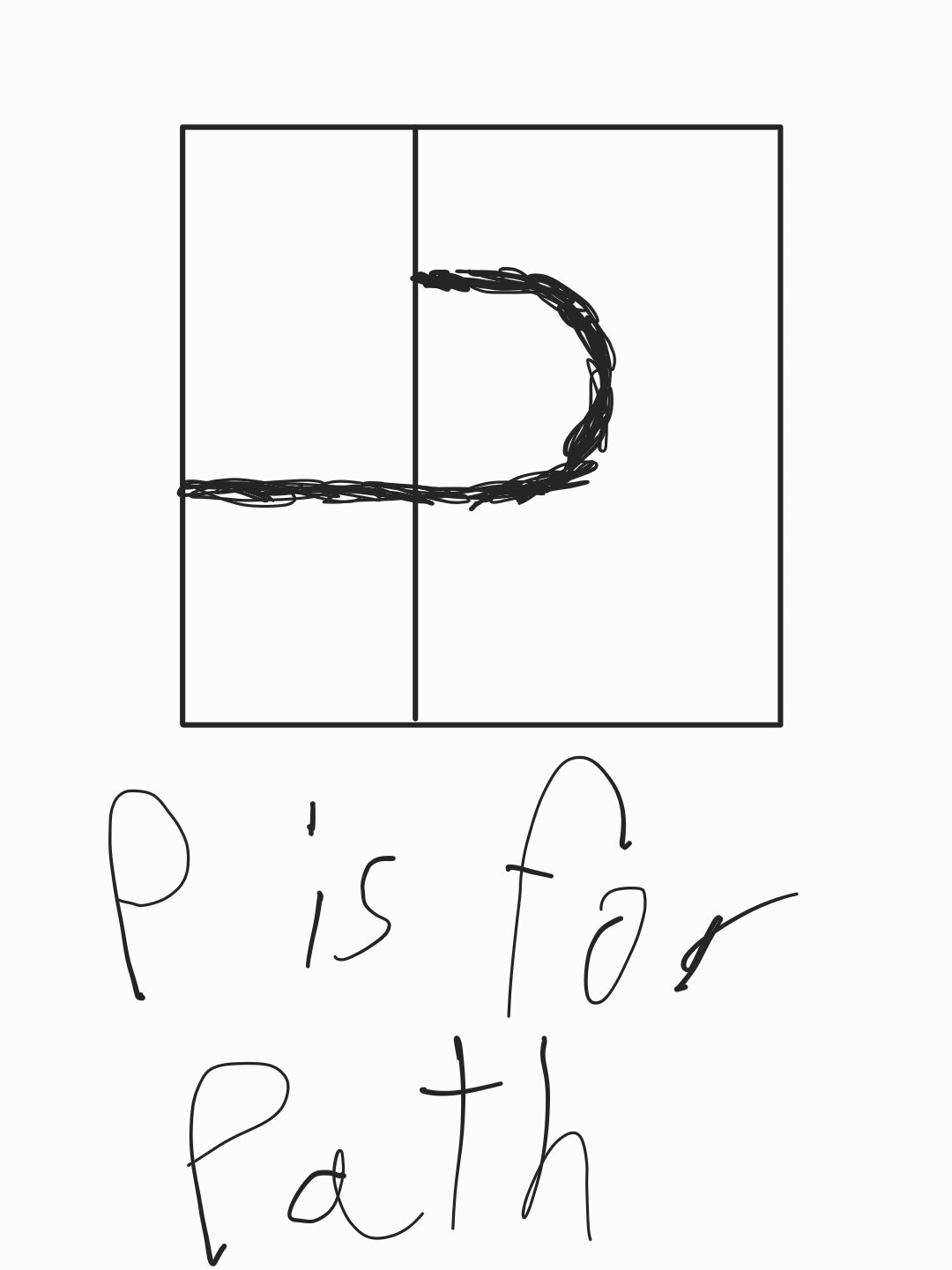
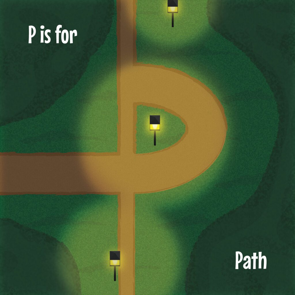
This sketch I made on my phone trying to gauge the space and placement of the letter “P”, while also playing with varying line thicknesses to create the idea of two contrasting paths. Similar to the sketch for the letter “H”, this sketch also served as the foundation for the final version.
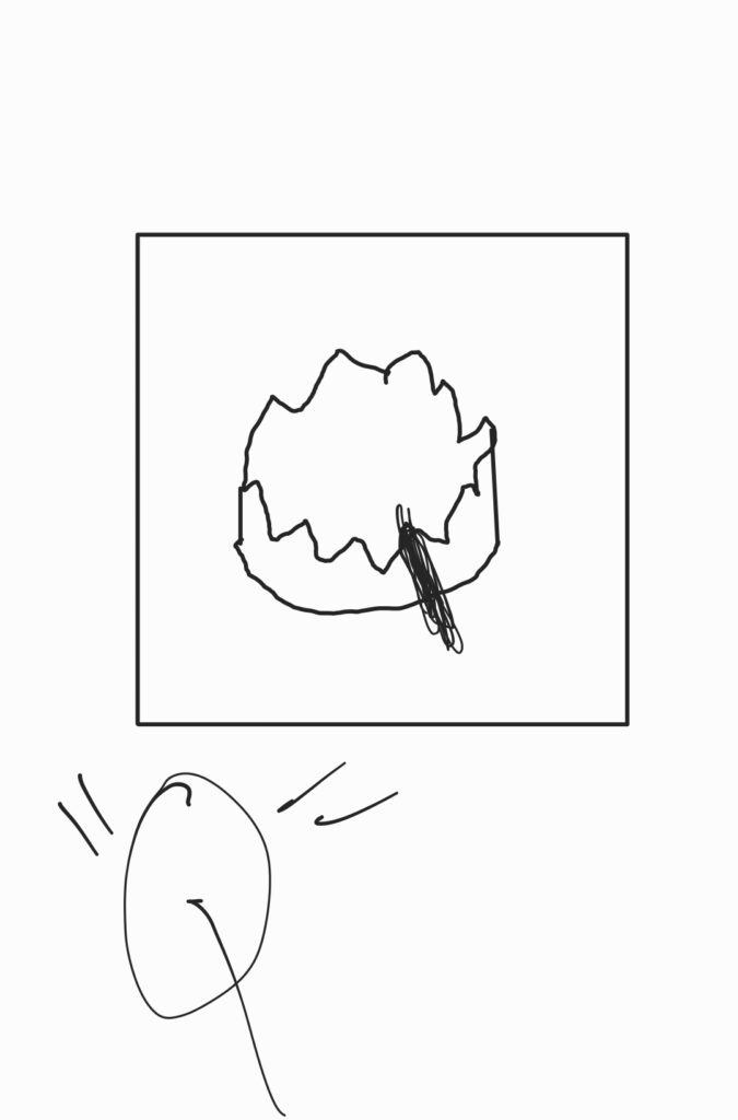
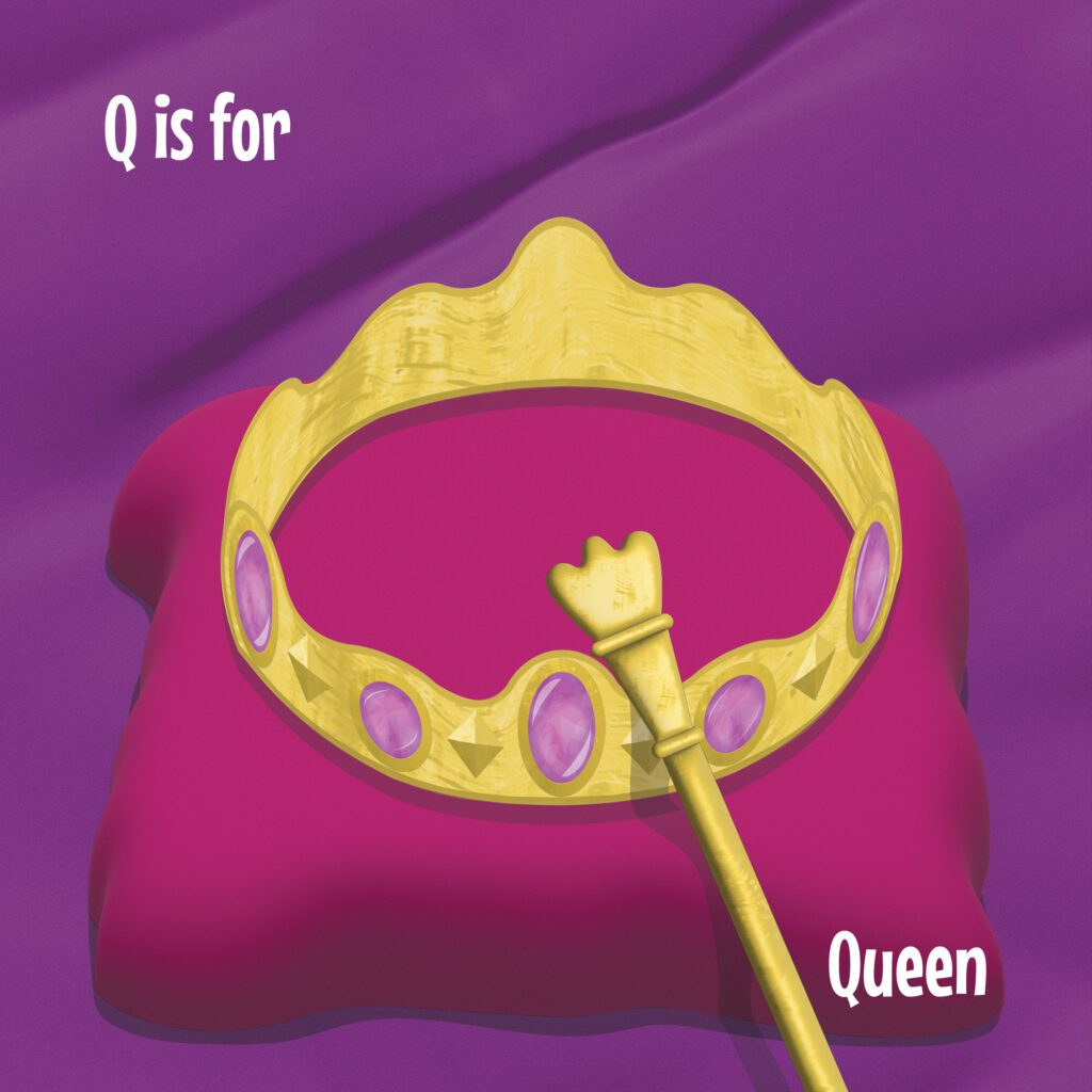
This sketch I also made on my phone trying to conceptualize a way to represent the idea of a queen, while also using whatever objects I incorporated in the design to form the shape of the letter “Q”. It took a while to figure out an idea, ultimately coming up with a scepter resting against a crown. The sketch was referenced for the final version of the letter “Q”.
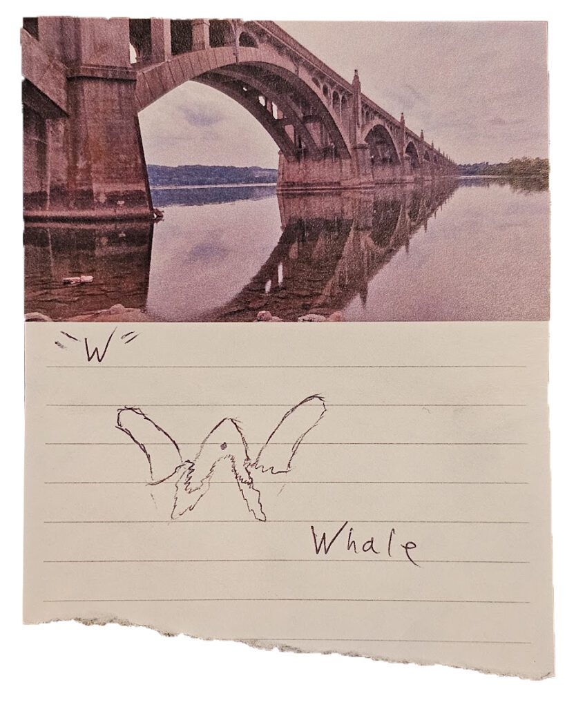
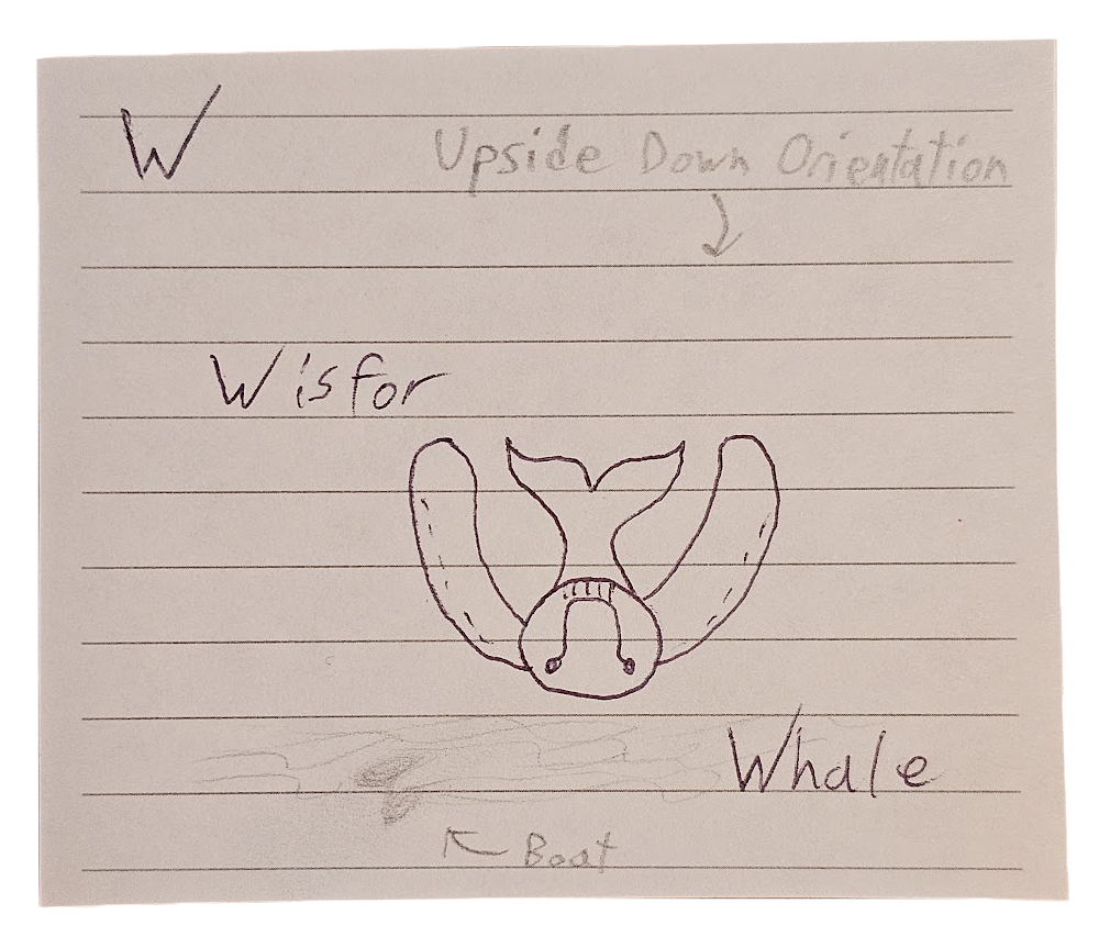
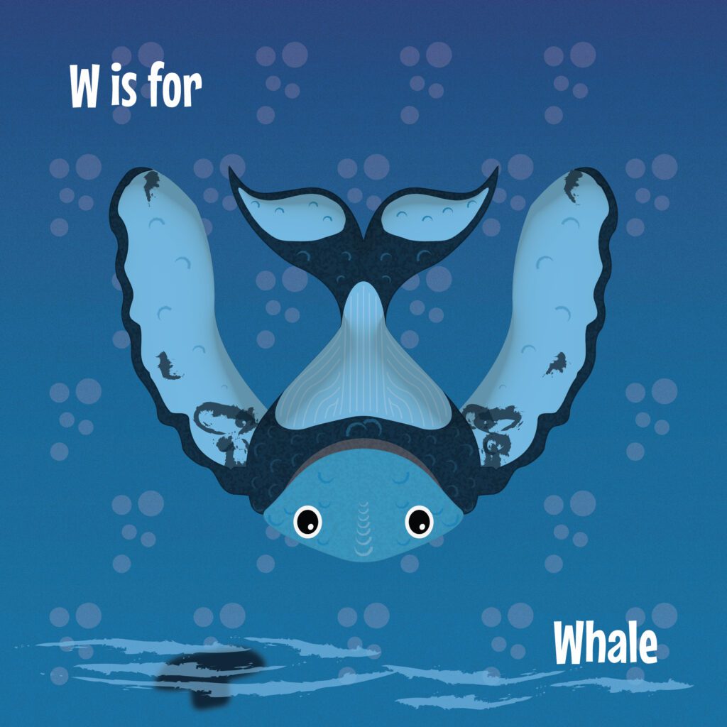
These 2 sketches also came late at night when I was struggling to figure out how to illustrate a whale in the shape of the letter “W”. The first sketch at the top played with the idea of a whale surfacing for air with its fins and head lifted above the water. However, I found greater success with the 2nd sketch in simply inverting the orientation of the viewer to see the whale upside down. In doing so the fins make up the walls of the “W”, and the head, body, and tail of the whale make up the middle cross-section of the “W”.
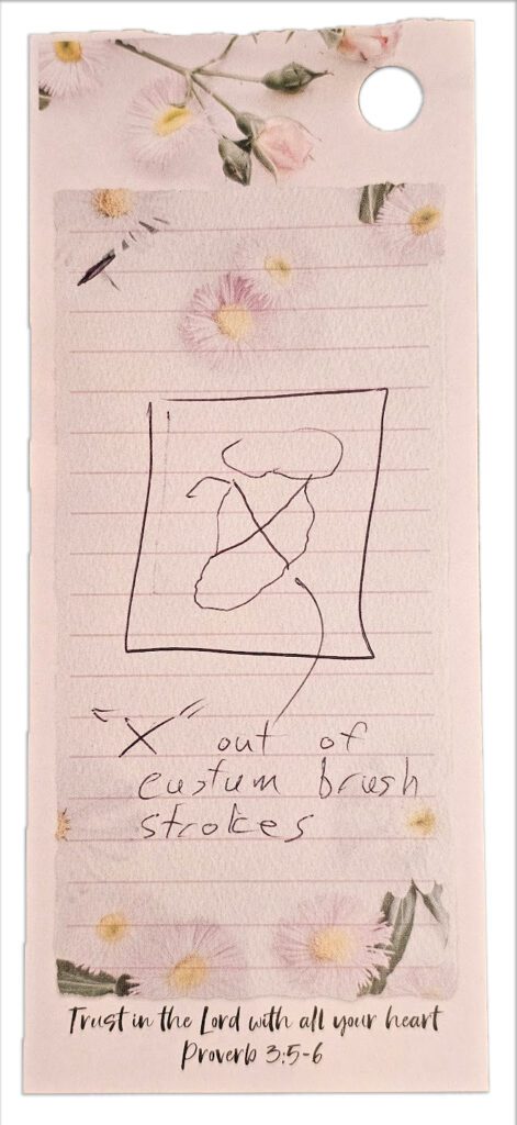
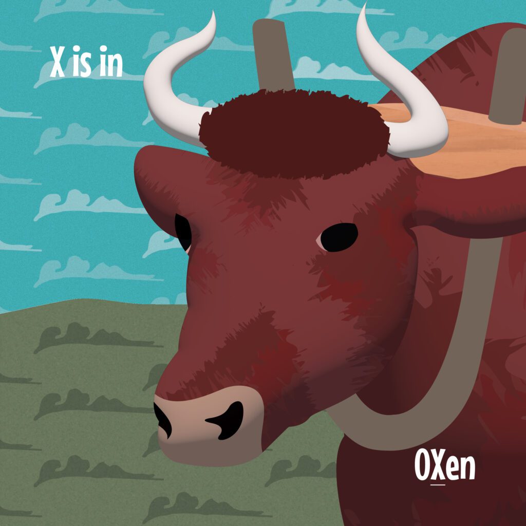
This sketch was my last sketch as I was coming towards the completion of the series, leaving only the letters “X” and “Y” to be completed. Here I came up with the idea of blending the shape of the letter “X” in the fur of the Ox. While it may be considered “cheating” from my standards in comparison to the rest of the illustrations, I say it’s totally ok cause I’m the artist! 🙂
